Motivation
◦ Increasing usability to overcome existing interface limitations
◦ Utilizing research insights to elevate the user experience
◦ Improving clarity and perception of data
◦ Boosting user satisfaction through intuitive design and usability enhancements
◦ Upgrading overall platform usability and user interactions
◦ Enhancing campaign entity features for greater flexibility and control
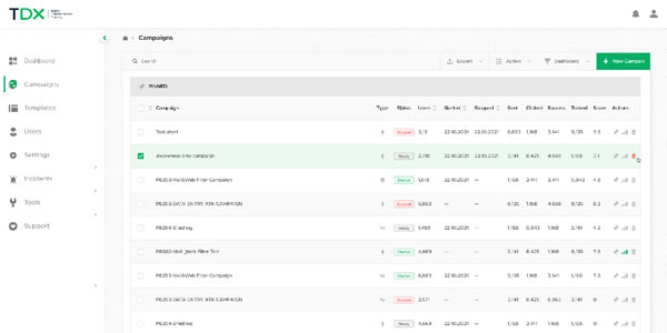
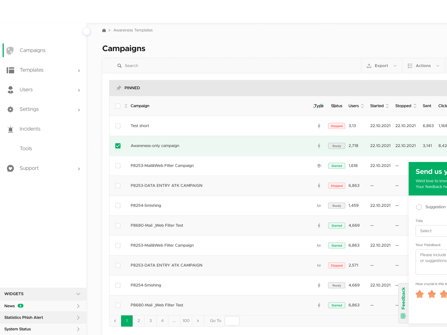
Old design showed a simple table
Discovery & Research
◦ Competitive analysis
◦ Review of support tickets
◦ Shadowing customer success team
◦ User interviews
◦ User video interviews
◦ Innovation workshop
◦ Channels mapping

Cross departmental innovation workshop to guide our way and gain support for a big project
Findings
◦ The absence of an overview system caused UX issues and reduced usage.
◦ Lack of option for overview system led to UX issues and less use
◦ The system is confusing, particularly the training modules and cybersecurity compliance status indicators
◦ Extensive workarounds by users to obtain and organize their data
◦ Combining individuals from various departments led to great ideas.
◦ Admin control and data access are key
◦ Integration of multiple sources leads to deeper understanding of the user’s needs
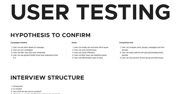
Are we on the right track? User testing
Wireframes
Wireframes were created for all options and possibilities. This allowed fast testing and many iterations in a very short time frame. This also allowed us to do many inner user testing and get other stakeholders, departments and higher management onboard and involved in the project.
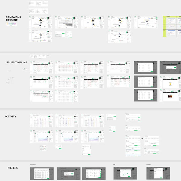
Wireframes under work
Design
Working with product managers and R&D, we divided the design into small chunks for easier development and integration. Each segment designed for up to 3 months of dev work

Main view for stage one of the dashboard development

Stacked view of the timeline. A clear view of all campaigns at once
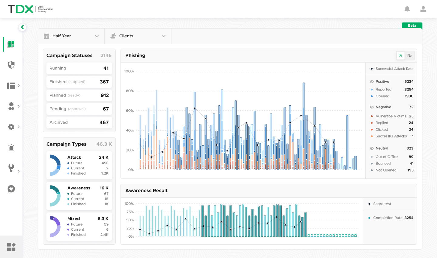
Stacked statistics view for phishing and awareness campaigns. Past, present and future.
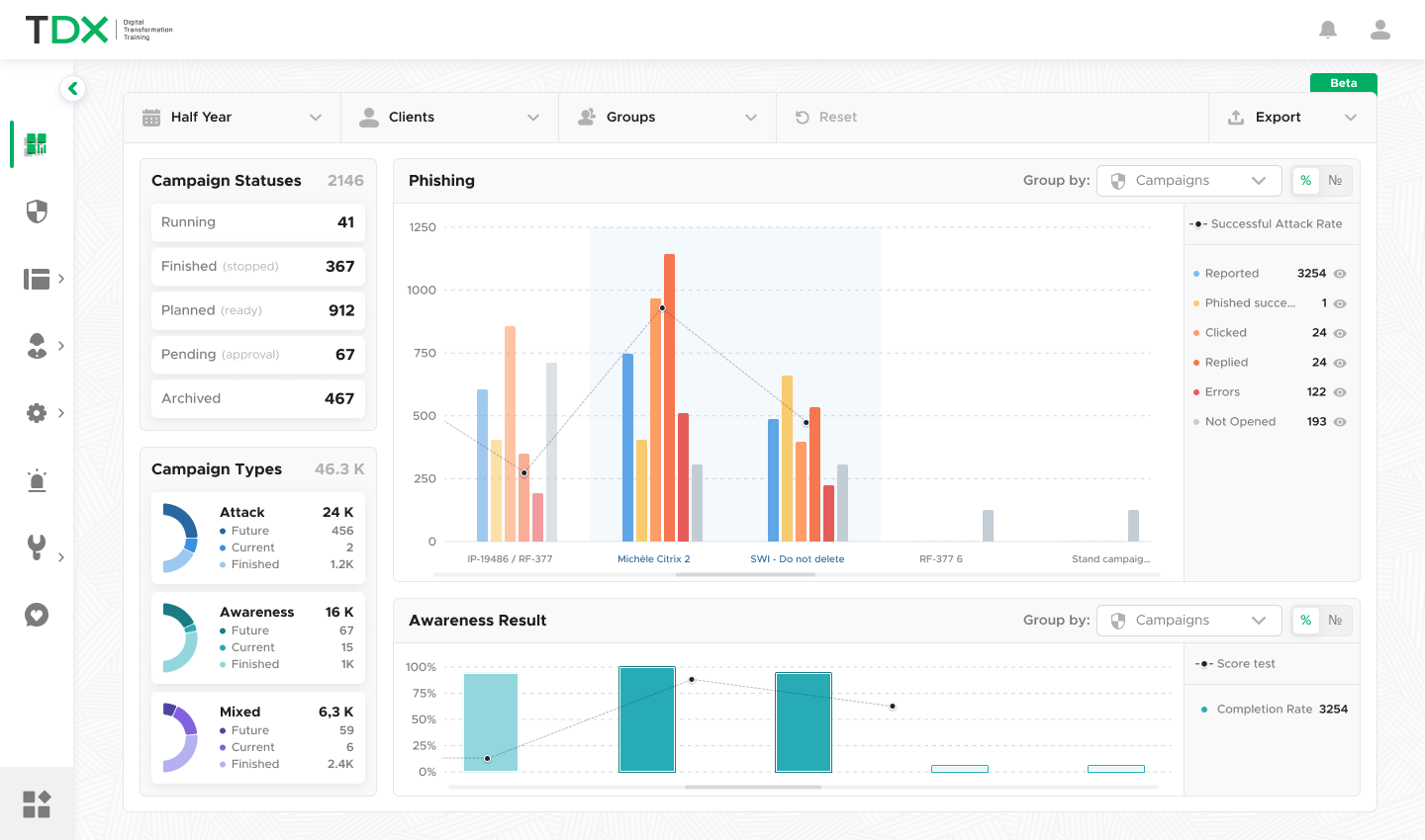
Grouped view of the statistics

Statistics attached directly to the timeline to show effect of specific campaigns on client's compliance