Overview
Lucy is a SaaS platform specializing in phishing simulations and cybersecurity training for large organizations. The system enables customers to create, manage, and analyze phishing campaigns, educating employees and strengthening organizational cybersecurity defenses.
The Challenge
Despite its robust feature set, Lucy faced significant challenges:
Cluttered User Interface: The UI was overloaded with information, making it difficult for users to focus on essential tasks.
Overwhelming Complexity: The interface was cluttered with an excessive number of options, making navigation a daunting task.
Outdated Design: The visual design hadn't been updated since the product's inception, giving it an obsolete appearance.
Poor User Experience: Basic functions required users to navigate through multiple screens, leading to inefficient workflows. System status was unclear,
Lack of Intuitive Organization: Settings and options were scattered across numerous pages without logical grouping.
Absence of Overview Capabilities: There was no efficient way to gauge the overall status of the system or track employee progress.
Inconsistent Design Elements: The lack of a unified design system resulted in a disjointed user experience across different parts of the application.
Initial state of Lucy
These issues resulted in Lucy being perceived as the cheapest option in its category, despite its robust feature set. Our mission was clear: transform Lucy from a powerful yet intimidating tool into an intuitive, user-friendly platform that could compete with top-tier solutions in the market.
The Mission
As the UI/UX Department Manager and Product Designer, my task was to transform Lucy from a powerful yet underutilized tool into an intuitive, user-friendly platform that could compete with top-tier solutions in the market. We developed a strategic plan with immediate, intermediate, and long-term objectives:
Immediate Goal:
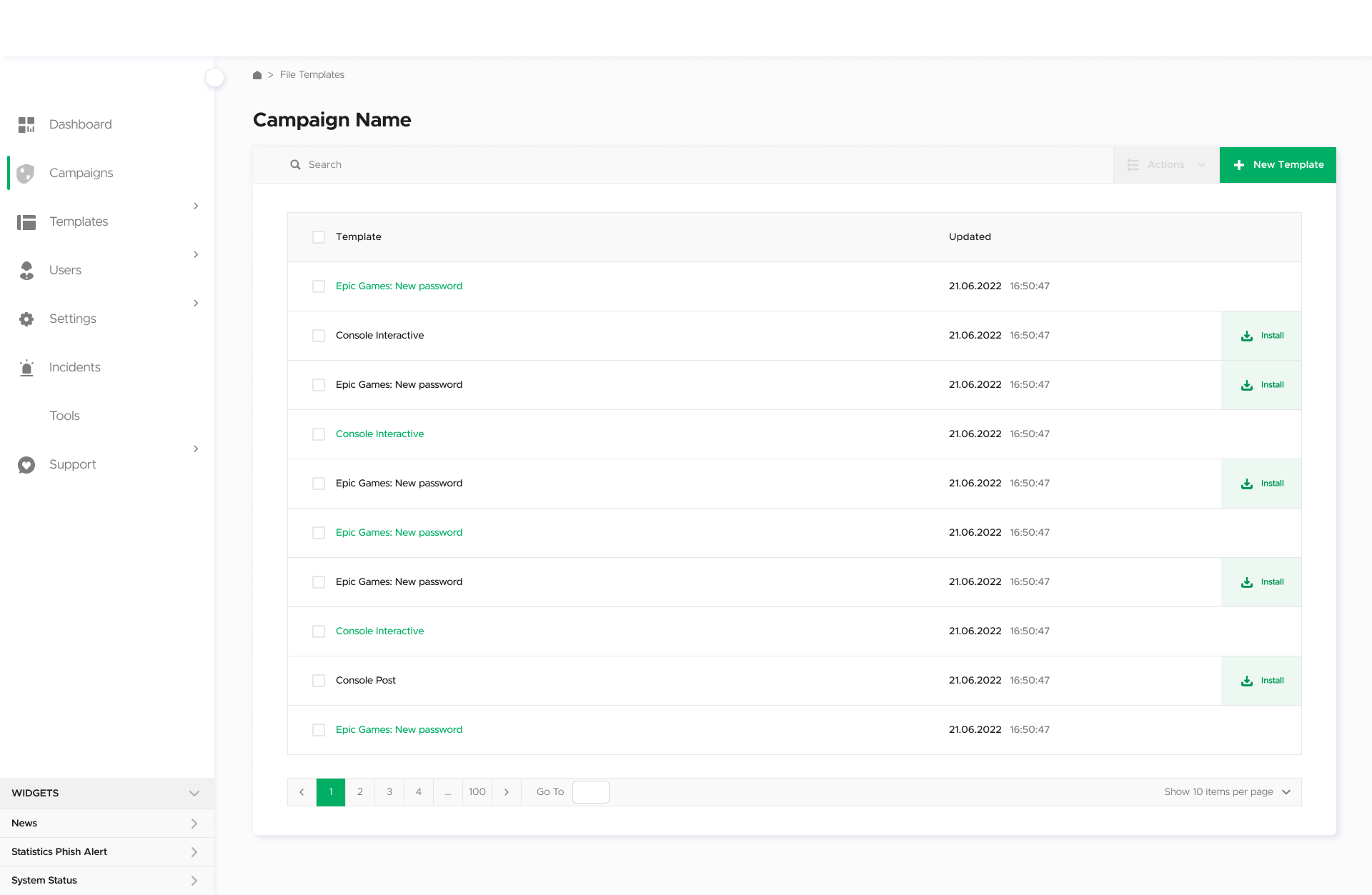
Visual Interface Overhaul
Visual Interface Overhaul
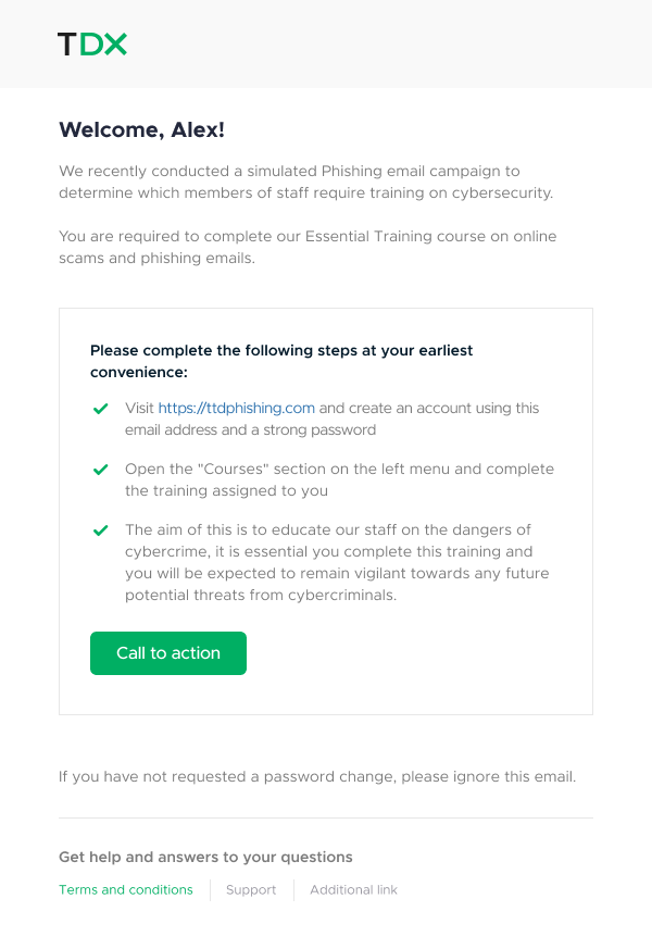
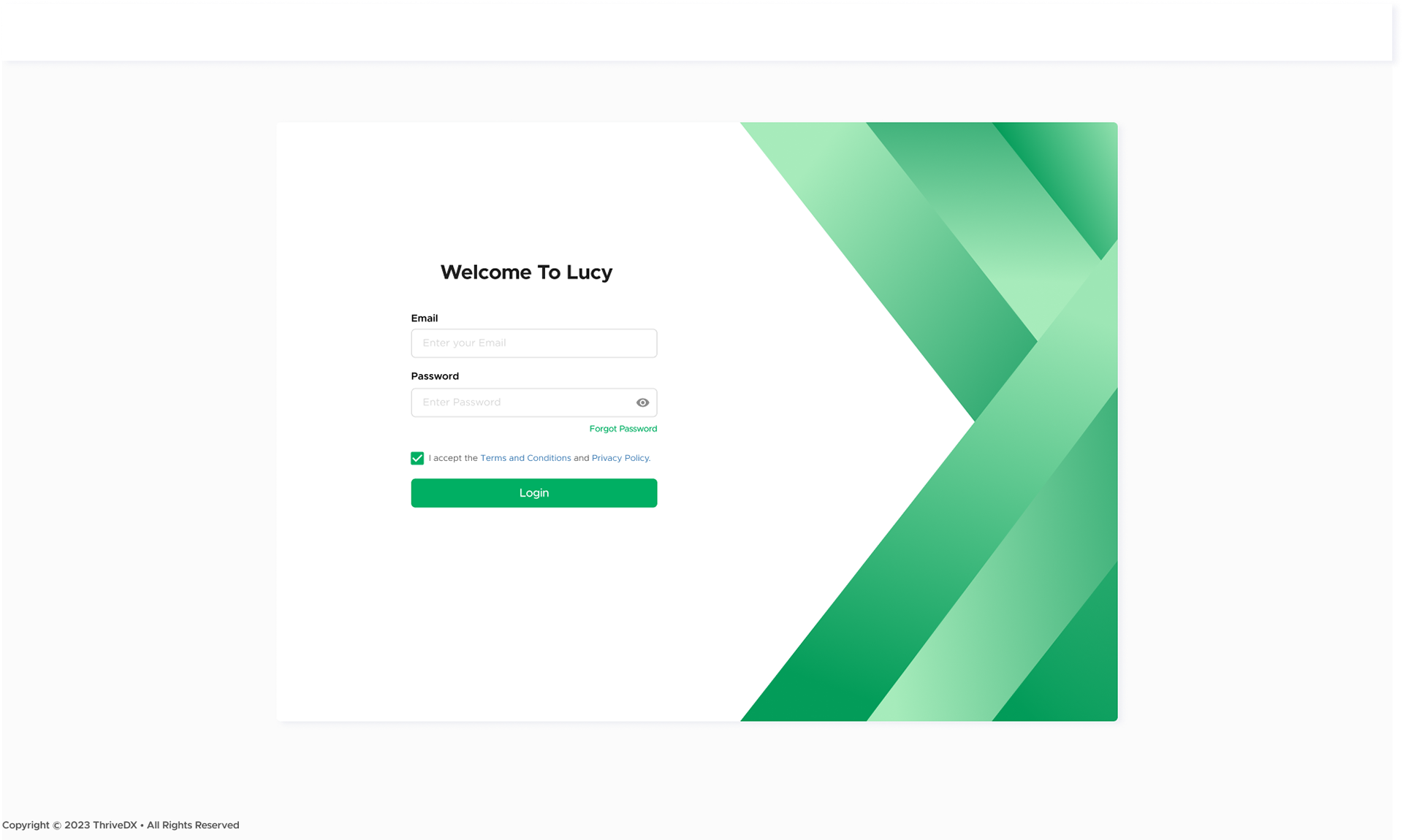
User interviews revealed the app's outdated look hindered sales and user confidence. We implemented a unified design system to align Lucy's appearance with its advanced capabilities, boosting market position.
Intermediate Goal:
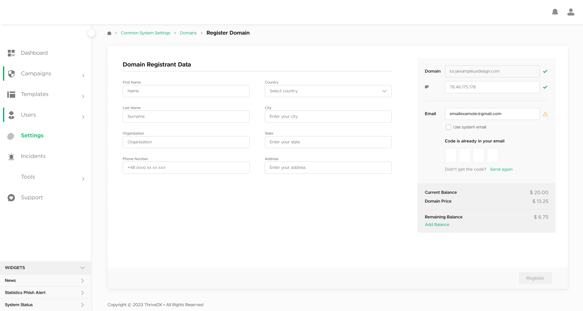
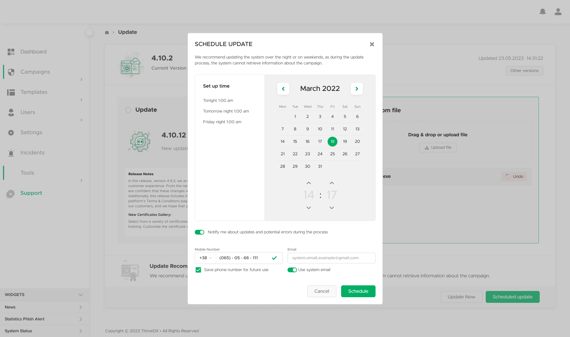
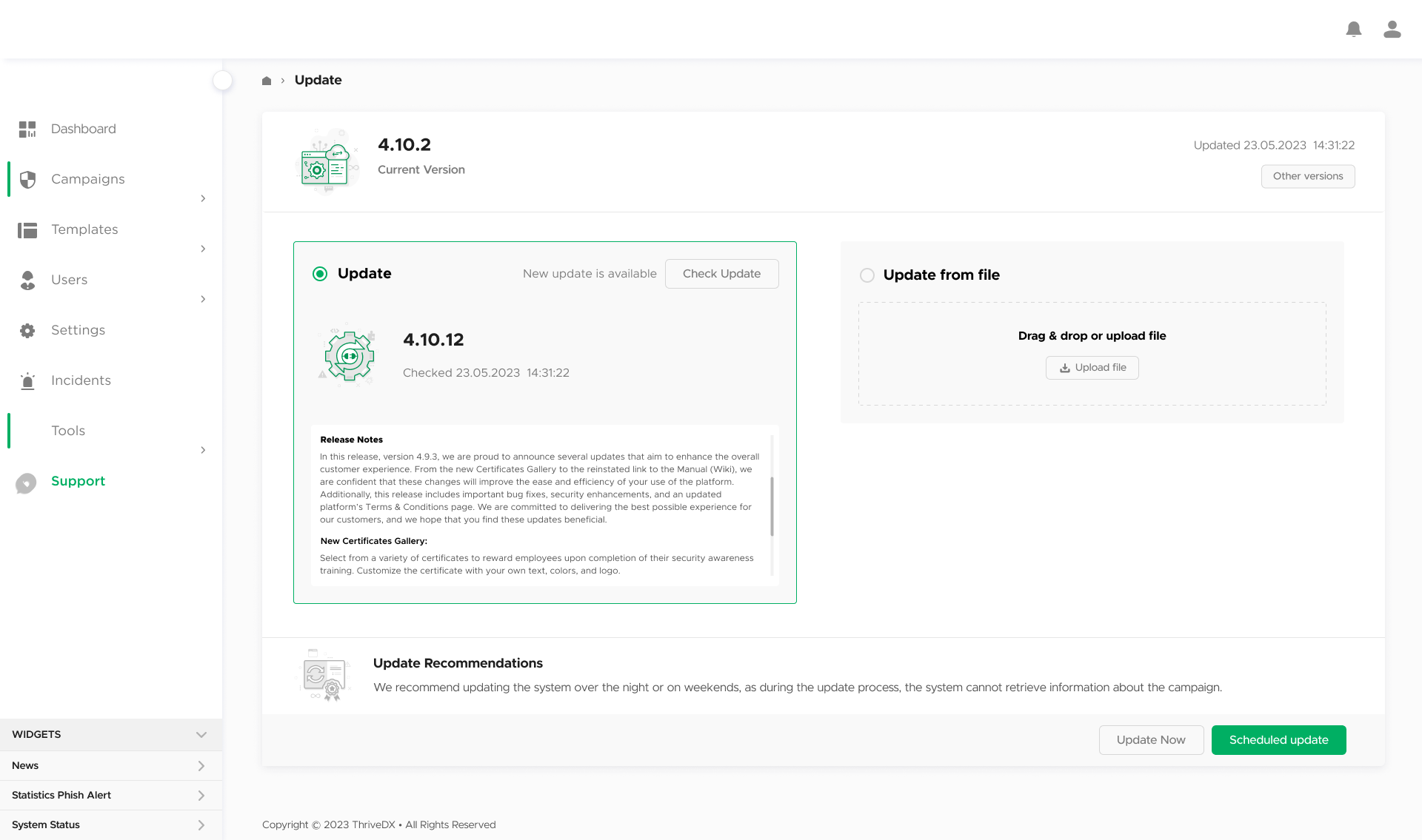
UX Enhancement
UX Enhancement
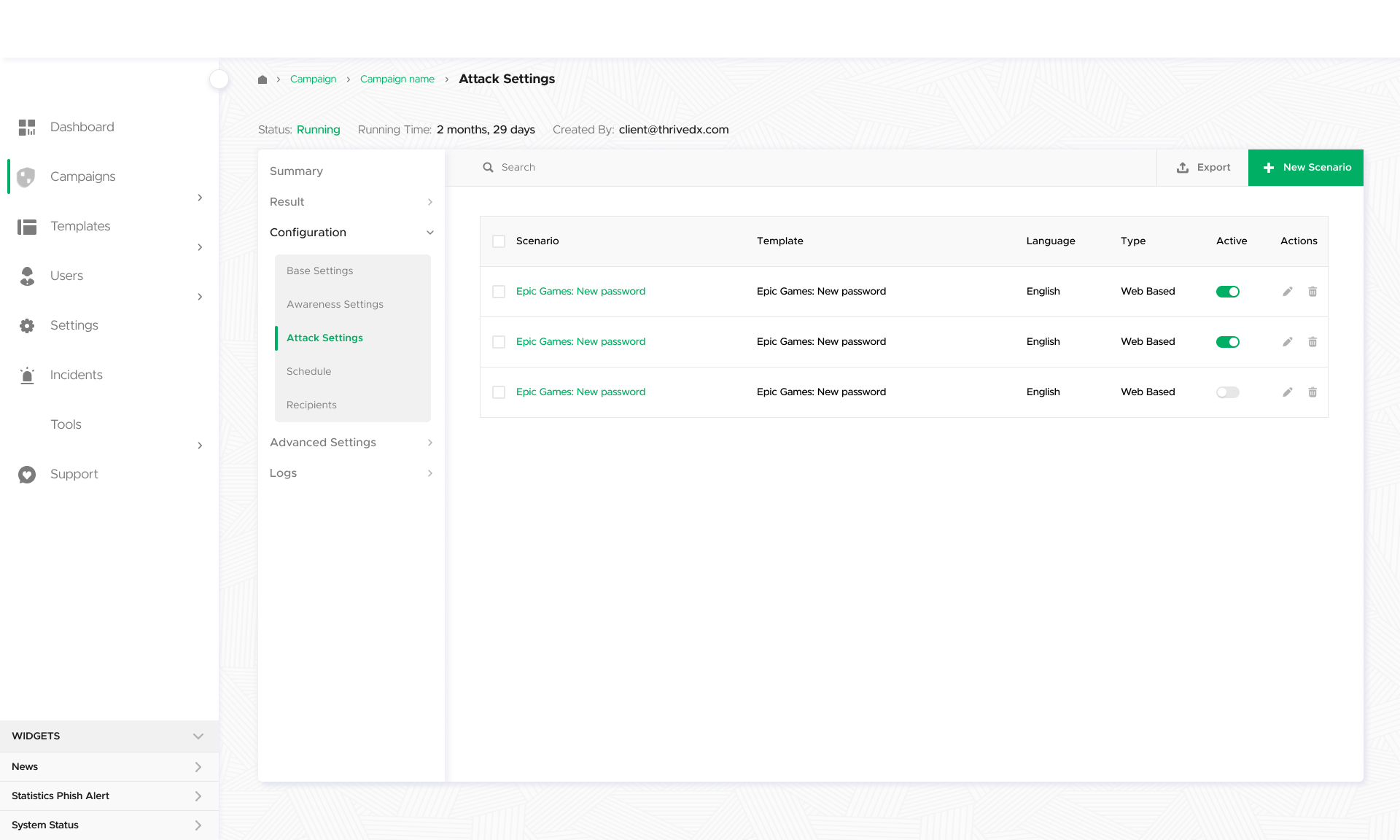
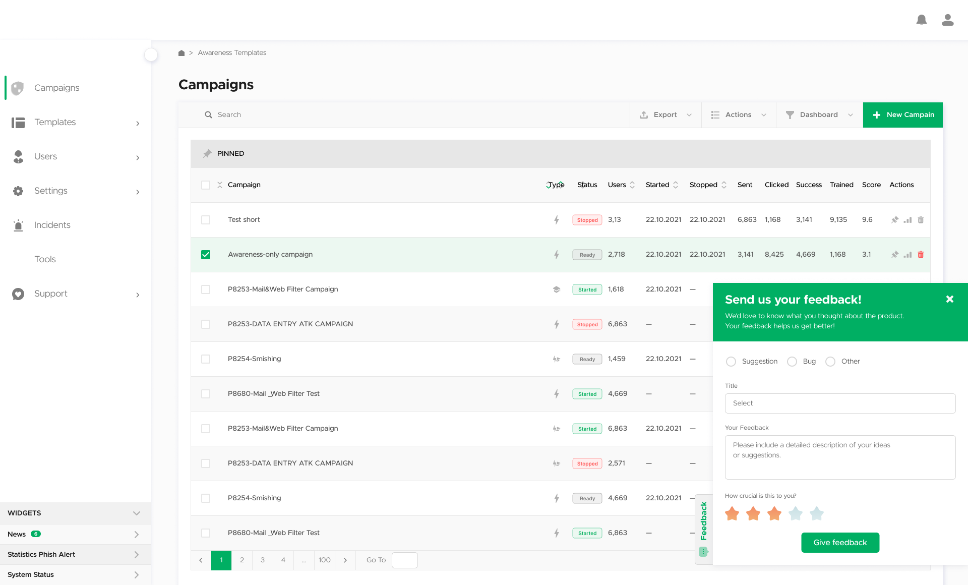
We addressed critical usability issues, redesigning key features and workflows. This resulted in increased system usage and user satisfaction, though further improvements were still needed.
Long-term Goal:
Strategic Development
Strategic Development
Moving from prevention to initiation, we conducted comprehensive user research, including shadowing, testing, and stakeholder interviews. This laid the groundwork for new features and ensured Lucy could scale to meet evolving market needs.
Immediate goal: Visual Interface Overhaul:
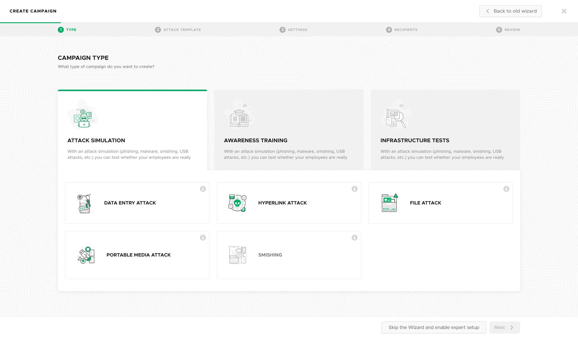
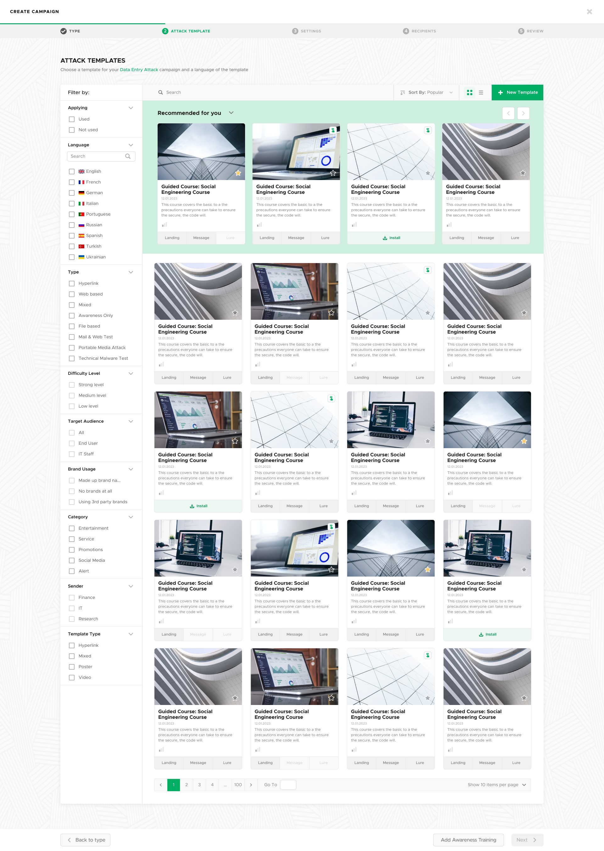

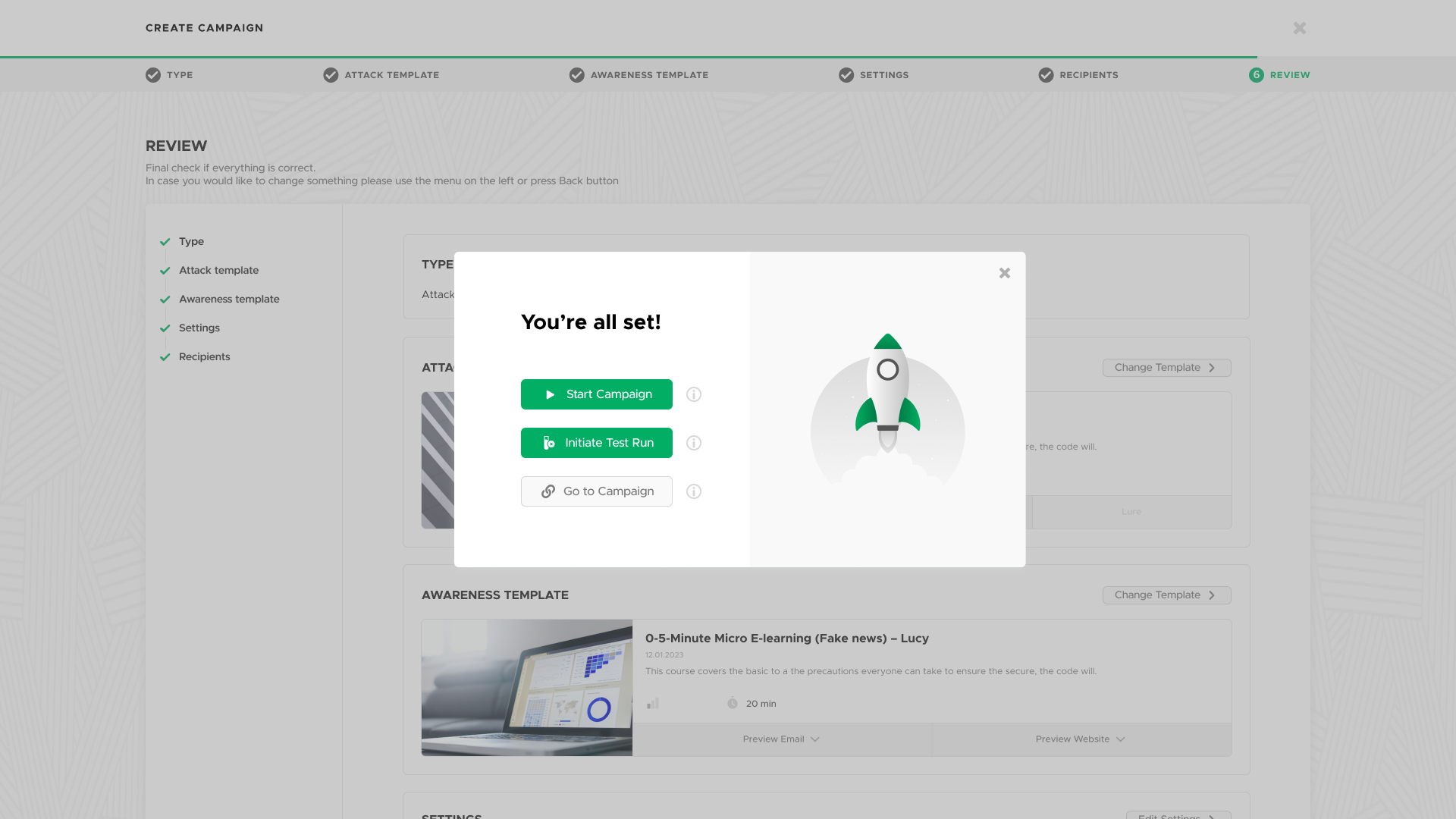
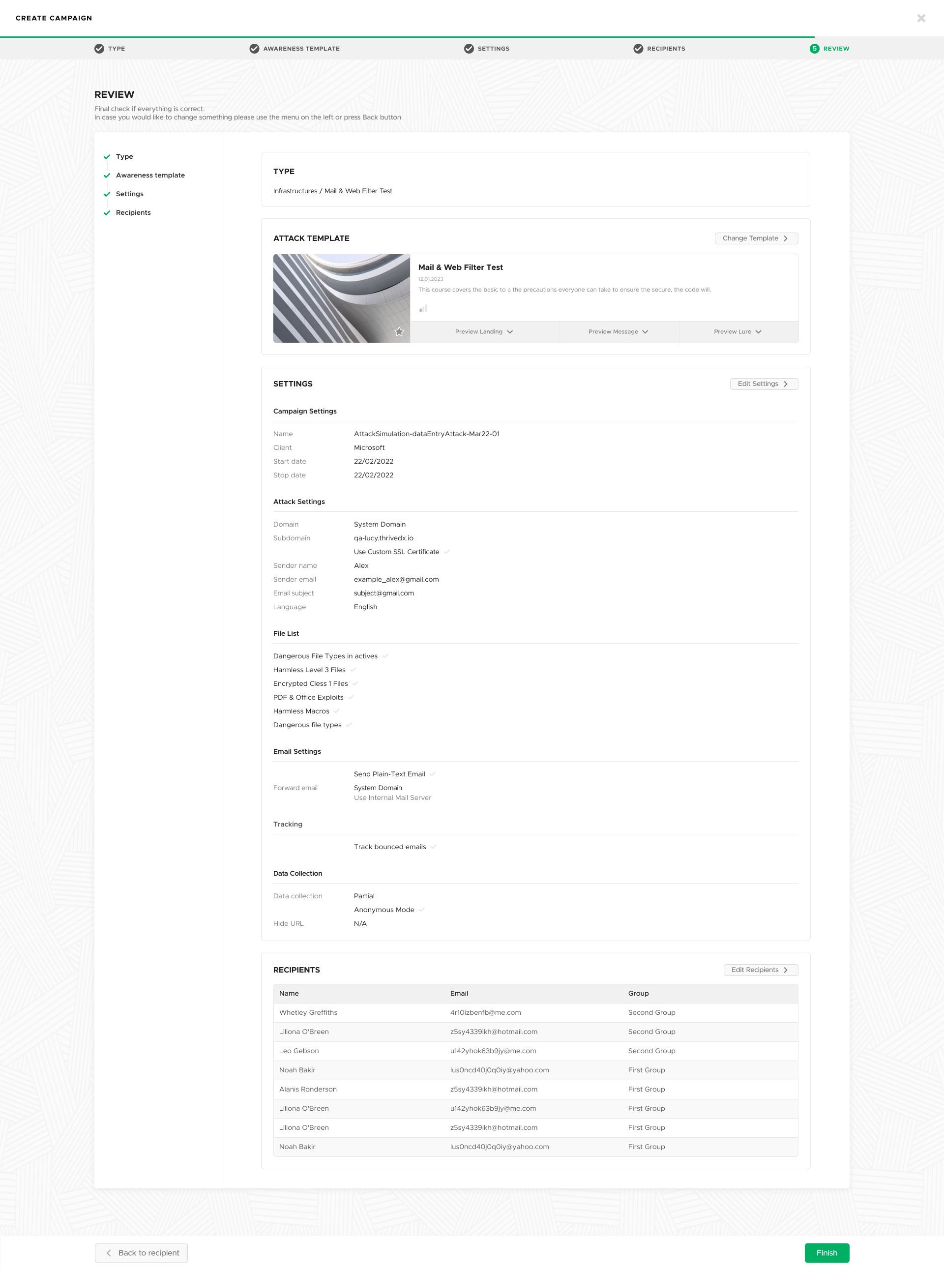
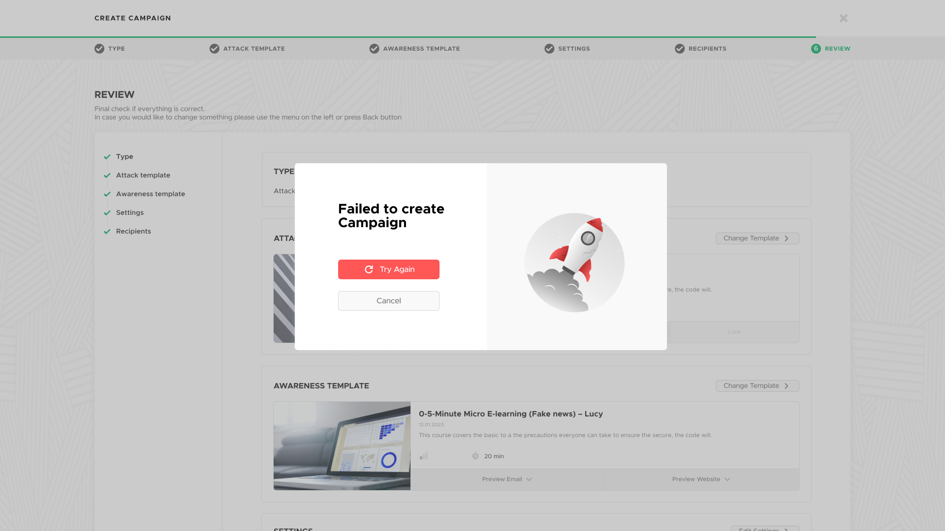
Intermediate Goal: UX Enhancement

Long-term Goal: Strategic Development
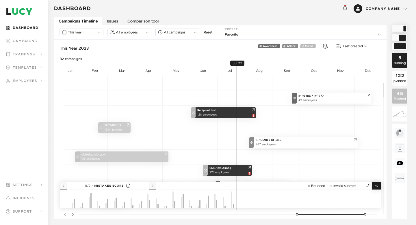
Wireframes dashboard timeline
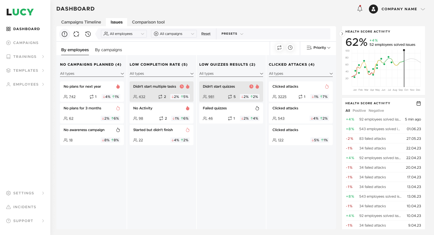
Wireframes dashboard issues
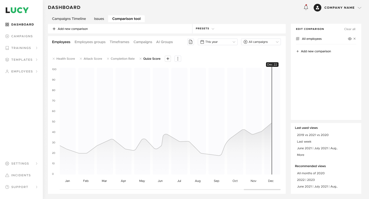
Wireframes dashboard comparison

UI dashboard timeline cascading / planning
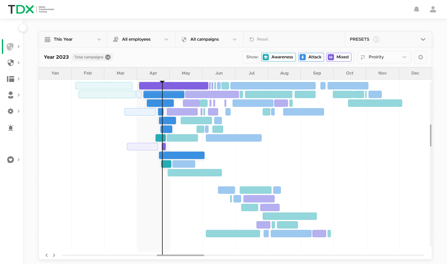
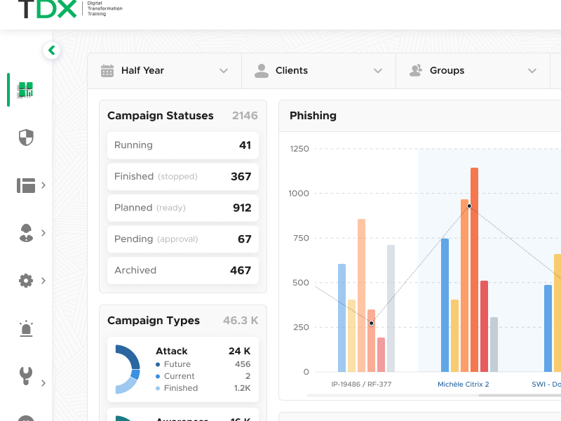
UI dashboard overview
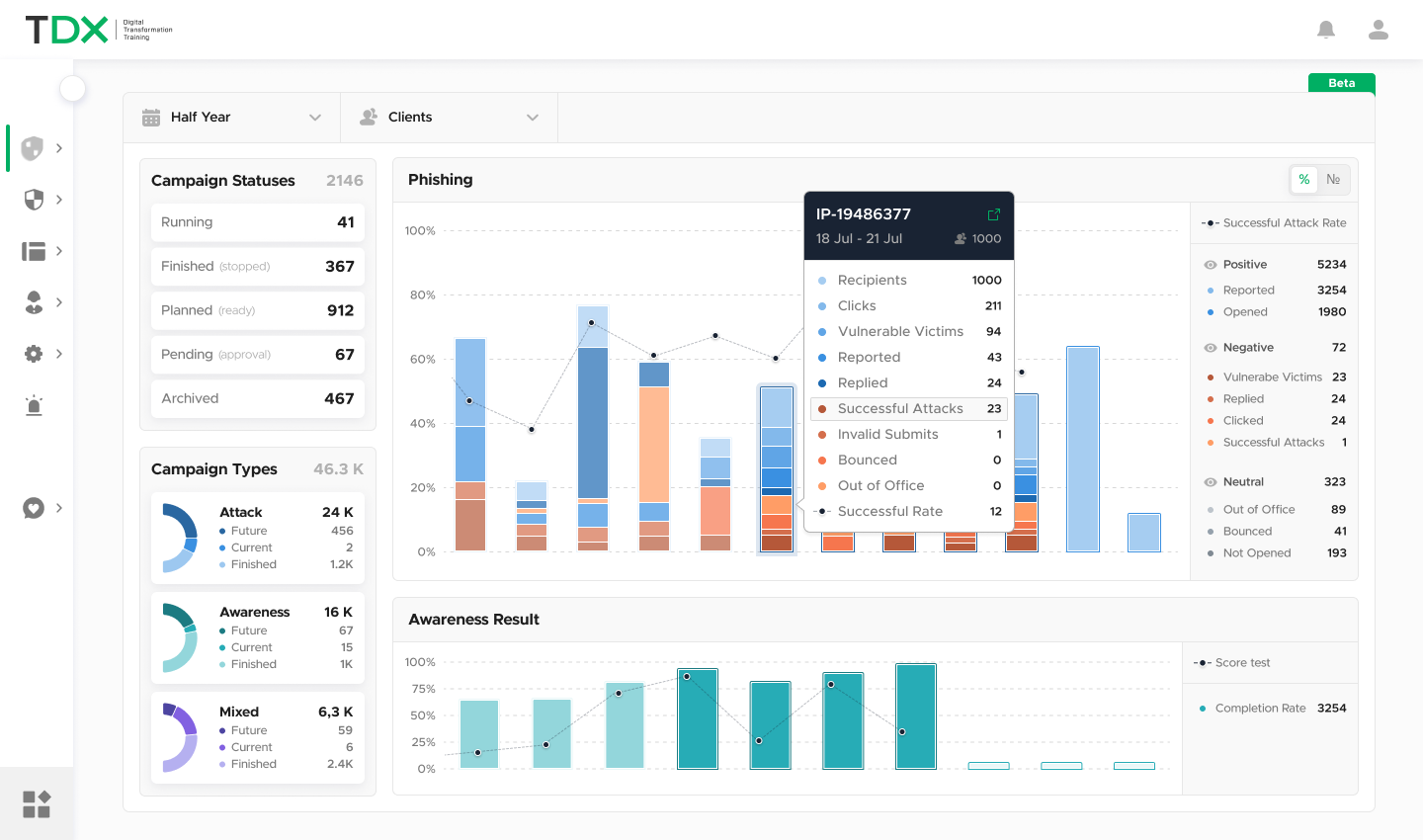
UI dashboard stats
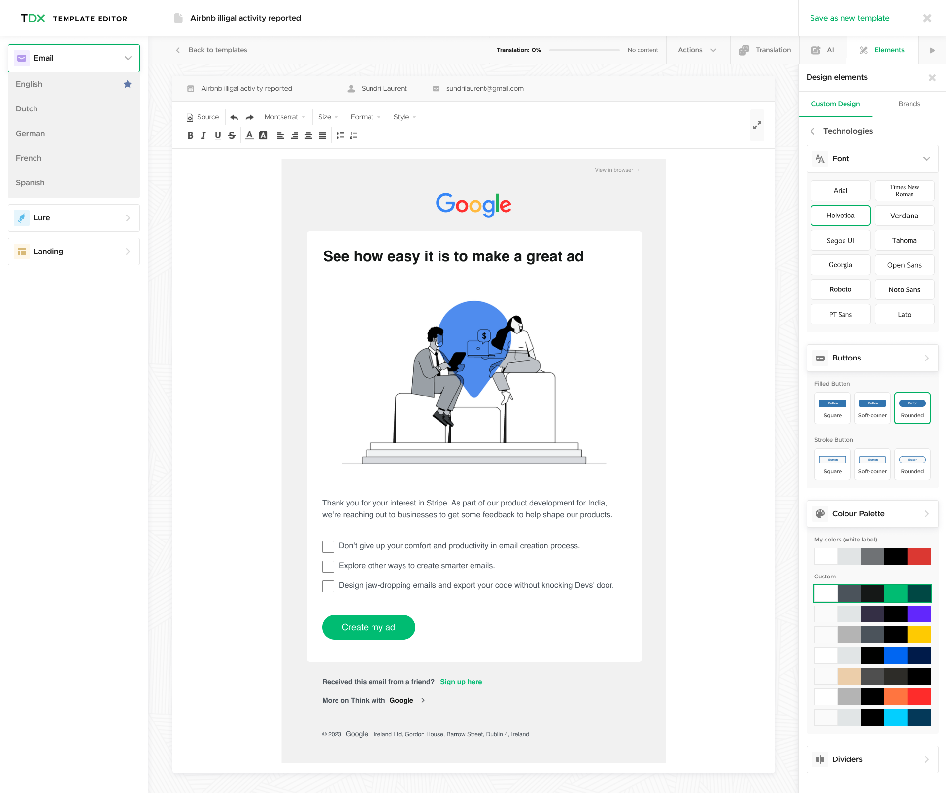
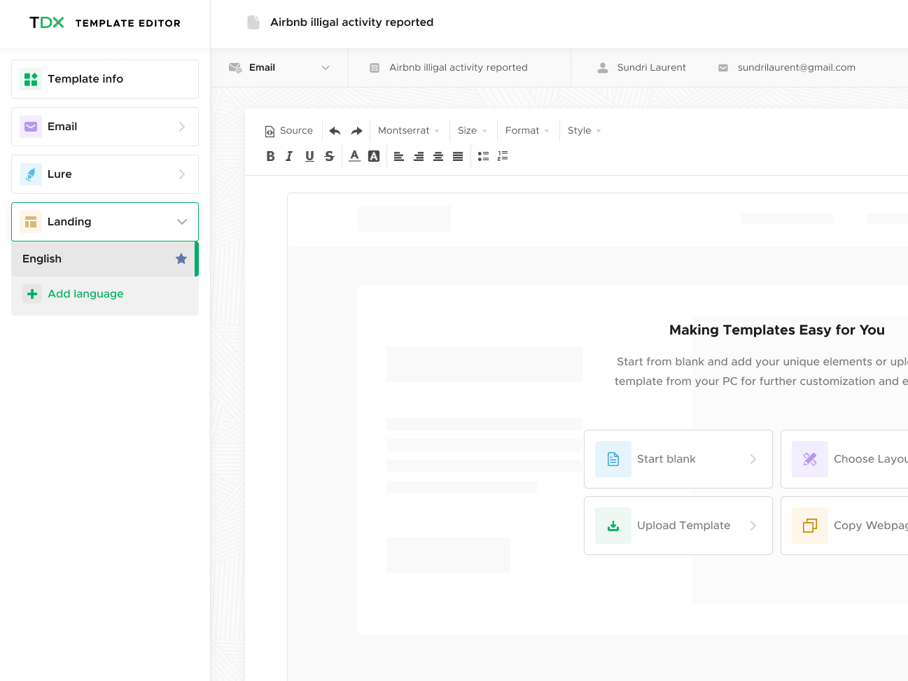
Template editor design elements menu
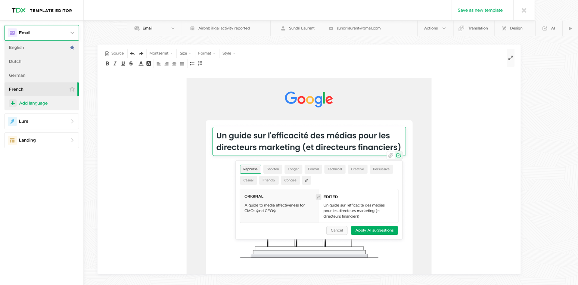
Template editor translator
The Process
Pre Work
* Schematic Mapping: Created a detailed legend to classify each page and element based on complexity and uniqueness.
* UX Heuristics Analysis: Developed an extensive Excel file documenting hundreds of UX issues, their locations, violated heuristics, and improvement suggestions.
Design Approach
* Focus on Familiarity: Create a comfortable, recognizable interface.
* Minimal Learning Curve: Prioritized ease of use due to the platform's inherent complexity.
Phased Implementation
* Phase 1 (Immediate Goal): Visual Interface Overhaul
Concentrated solely on UI improvements without altering UX.
* Phase 2 (Intermediate Goal): UX Enhancement
Utilized MoSCoW model to prioritize UX issues from the heuristics' analysis.
Focused on implementing "Must have" improvements over a six-month period.
Long-Term Strategic Design
User research with design partners and stakeholders revealed two major pain points: lack of long-term planning capabilities and content issues (quality, variety, localization). To address these, we held an innovation workshop, resulting in three strategic solutions: an AI-based template editor, an advanced template editor with translation capabilities, and a timeline-based dashboard for comprehensive planning. development involved iterative wireframing, user testing, and incremental implementation with the dev team.
Lucy's Schematic map
Impact
The redesign of Lucy yielded significant positive and consistent increase in user satisfaction. The platform's improved usability and functionality led to a notable reduction in churn rates. Perhaps most tellingly, users became increasingly engaged with the product's development, with many volunteering to become design partners for future iterations. This enthusiasm not only validated our design decisions but also fostered a collaborative relationship with our user base, setting the stage for Lucy's continued evolution and success in the market.
Dashboard Wireframe - Comparison Tool

